UX patterns: streaming, sources, feedback
UX choices can make a mediocre RAG system feel great—or a great one feel broken.
The best retrieval and generation in the world mean nothing if users have a frustrating experience. UX choices—how you display responses, how fast the system feels, how users can provide feedback—determine whether your RAG system is delightful or disappointing. This chapter covers the patterns that make RAG systems feel responsive, trustworthy, and improvable.
Streaming and perceived latency
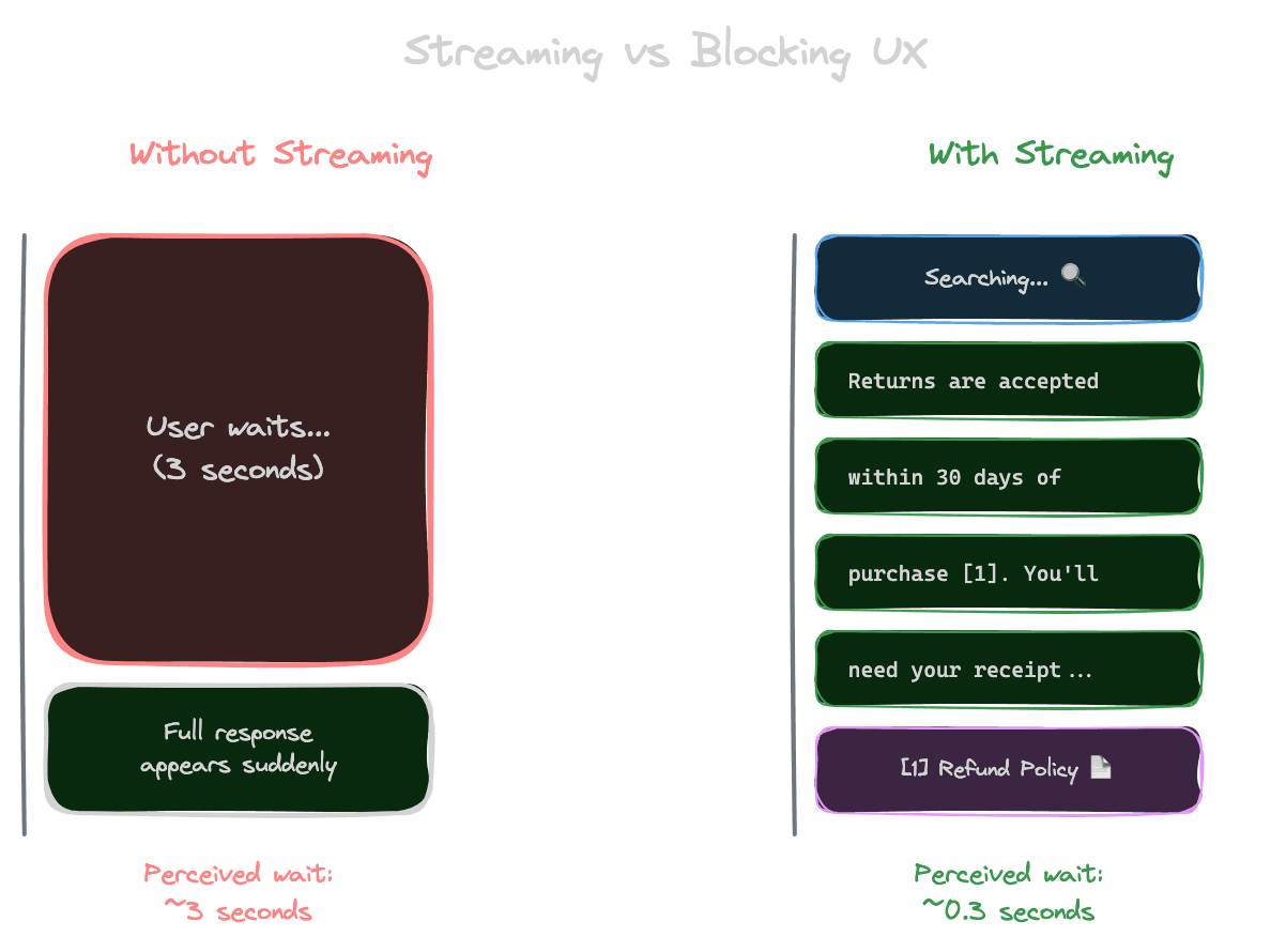
Users perceive latency based on when they see the first response, not when the complete response arrives. Streaming tokens as they're generated makes the system feel faster, even if total time is the same.
Without streaming, a 3-second response feels like 3 seconds of waiting, then a sudden wall of text. With streaming, users see text appearing almost immediately, and 3 seconds pass while they're reading. The perceived wait is nearly zero.
Implement streaming by using the streaming API from your LLM provider. Most providers support this. The response arrives as a stream of tokens rather than a complete response.
Consider what to show during retrieval. Retrieval happens before generation and can take 100-500ms. Some interfaces show a "searching" indicator during this phase, then switch to streaming text during generation.
Be careful with structured outputs and streaming. If you need to parse JSON or validate format before showing content, streaming is complicated. You might stream the visible parts while buffering parts that need validation.
Showing sources
Sources make answers verifiable and build trust. How you display them affects usability.
Inline citations place references directly in the text: "Returns are accepted within 30 days [1]." Users can see exactly which claims are supported by which sources. This is familiar from academic writing.
Source cards at the end of the response list all referenced documents with titles, snippets, and links. Users can explore sources without cluttering the main answer.
Expandable excerpts let users click a citation to see the relevant passage inline. This provides immediate verification without requiring users to open external documents.
Side-by-side layouts show the answer alongside source documents. Power users can cross-reference easily. This works well for research-oriented applications.
Consider your users' verification needs. For casual Q&A, simple numbered citations might suffice. For legal or medical applications, detailed source display might be essential.
Progressive disclosure
Not all users want the same level of detail. Progressive disclosure lets users choose their depth.
Show a summary answer first. Users who just need the quick fact can get it immediately.
Offer expansion. "Show more details" or "See sources" reveals additional information for users who want it.
Layer complexity. The default view serves 80% of users; advanced views serve users with deeper needs.
This pattern respects users' time while still providing comprehensiveness for those who need it.
Feedback collection
User feedback is gold for improving RAG systems. It tells you what's working and what's not.
Thumbs up/down is simple and low-friction. Users can signal satisfaction with minimal effort. This gives you a signal, though not much detail.
Detailed feedback forms ask what was wrong: "Was the answer incorrect? Off-topic? Missing information?" This provides actionable insight but adds friction.
Implicit feedback comes from user behavior: Did they click sources? Did they rephrase and ask again? Did they copy the answer? Behavioral signals don't require explicit action.
Corrections are the most valuable feedback. If users can fix wrong answers, you learn exactly what was wrong and what the right answer is.
Building evaluation datasets from feedback
Feedback can improve your evaluation datasets systematically.
Negative feedback (thumbs down, corrections) identifies failure cases. These become test cases: queries that should work better.
Positive feedback (thumbs up, no follow-up questions) confirms success cases. These validate that your system handles certain query types well.
Corrections provide ground truth. "The answer said 30 days, but it's actually 60 days" gives you the correct answer to use in evaluation.
Create a pipeline from feedback to evaluation. Regularly review feedback, extract test cases, and add them to your evaluation set. This creates a flywheel: production usage improves your ability to test and improve.
Error states and edge cases
How you handle failure affects trust as much as how you handle success.
No results should be communicated clearly. "I couldn't find information about that" is better than silence or an error page. Consider suggesting alternatives or offering to search differently.
Slow responses need communication. If retrieval or generation is taking longer than usual, show a message: "This is taking longer than expected..." Users tolerate delays better when they know what's happening.
Service errors need graceful degradation. If your vector database is down, what happens? An error message is the minimum; a fallback to cached results or general knowledge is better.
Rate limits and quotas need user-friendly handling. "You've asked a lot of questions today; please try again later" is better than a cryptic error code.
Accessibility and inclusivity
RAG interfaces should work for everyone.
Screen readers need proper structure. Use semantic HTML. Ensure citations are readable. Don't rely solely on visual cues.
Keyboard navigation should work fully. Users should be able to expand sources, submit queries, and navigate results without a mouse.
Language and reading level matter. If your users include non-native speakers, consider simpler language in responses. Some applications benefit from adjustable complexity.
Mobile experiences need attention. Long answers are harder to read on small screens. Consider mobile-specific formatting or summaries.
Measuring UX success
Beyond answer quality, measure the experience.
Time to first byte indicates perceived speed. How quickly does streaming start?
Engagement metrics show interest. Do users read full answers? Click sources? Ask follow-ups?
Abandonment shows frustration. Do users leave without getting an answer? Rephrase repeatedly?
Satisfaction surveys get direct input. Periodic "How's your experience?" questions provide qualitative insight.
Combine metrics for a complete picture. High answer quality with poor UX metrics suggests the interface is the problem, not the retrieval.
Next module
With generation complete, Module 7 covers evaluation—how to systematically measure and improve your RAG system's performance.